


Using Rockpool In A Warm Colour Scheme
Putting a room scheme together isn't easy, it takes time to find the things you love and can afford! I want to share how I decorated my spare room with you and I hope you will find some inspiration. I love mood boards, they help me gather my thoughts and I can immediately see if things work together. It becomes really obvious if something isn't the right colour or style. I like Canva for this process, it's really easy and they have lots of templates to choose from.

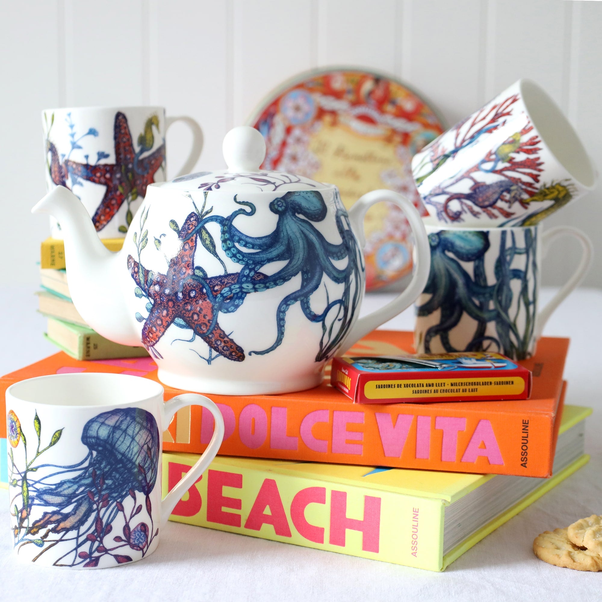
I live in a 500 year old cottage by the River Fal and my spare bedroom is quite small with a low, deep beamed ceiling. I wanted to keep the room feeling warm and cosy, with a nod to the beautiful coast we live on. This is why I chose our Rockpool fabric for my curtains. It’s illustrated with beautiful shells inspired by a day of beachcombing on Pendower beach, on the Roseland peninsula.
I painted all the woodwork in Farrow and Ball strong white and I lime washed the walls in a beautiful colour called Petal from Francesca’s paints. Francesca, [who owns Francesca’s paints], has the most wonderful selection of colours and if you can’t find exactly what you are looking for, she will mix something especially for you!
 Don't be afraid of lime wash, it's very easy to apply and creates the most patina on walls. It's quite addictive so don't be surprised if you find yourself lime washing every room.
For the curtains, I chose a cottage heading, using Oswin in a soft pink peach. This ticking stripe is from Romo, and it’s a collection I use a lot. It’s called Kemble, and has a large check, a smaller gingham style check, a plain and a wide stripe and narrow stripe, all in a great selection of colours. Very useful for creating some interest in a room.

A cottage heading creates a soft look and the longer you make the fold, the more it will fold over. I like to attach the tape so that there’s a 15cm overhang. It shows off the contrast lining and is perfect for showing off a contrasting fabric. I had them made an extra 20cm longer than the drop, so that they pool beautifully on the floor. For me, 20cm is the ideal amount.
I'm lucky enough to have a window seat and it creates a lovely vignette. I haven't put a blind in this room yet, but I probably will. I've got a privacy blind, which I lower to keep the sun out as the ultra violet light is so strong in Cornwall, it fades everything! I used a woven stripe from Warwick in pink and aqua which picks up the highlights in some shells in the Rockpool fabric.

I chose yellow to be my accent colour. I love adding an unexpected colour to a room. In this case I used a slubby linen from Warwick for my headboard, in a colour called cornsilk. It’s a lovely rich yellow and I wanted it to be removable so I could have a change if I felt like it. Plain white bedlinen shows off a beautiful Kantha quilt I bought in India, which look great against the yellow headboard. I chose a wide stripe in a deep yellow called Sunflower, also from the Kemble collection.

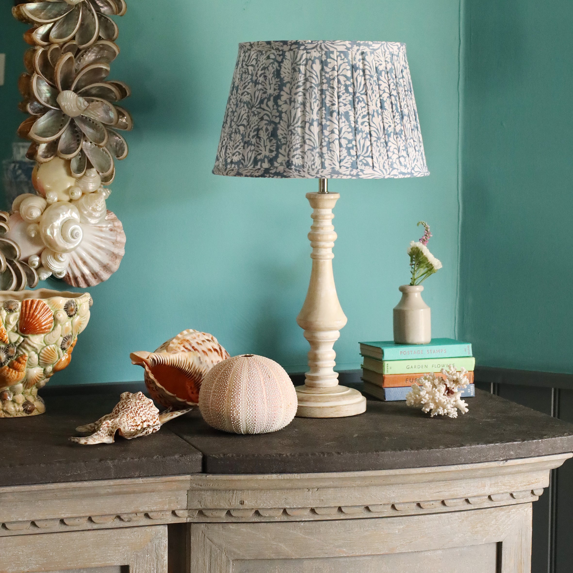
The perfect size for a bedside lamp is our Pixie lampbase. It comes in three colours which all look great, but I've selected our empire washed lamp bases with and either one of our Seafoam Paisley or Atlantic Shell lamp shades look good with this scheme.

I chose a scallop shell wall light in antiqued brass from Jim Lawrence. They have a great selection of lights with the scallop shell, in different finishes and even a wall light so you can plug it in. Perfect for plugging in without having to rewire!

What you'll see about this room is that I've used accessories that I've had for a long time. They all mean something to me, but also go really well in this room, reflecting the pinks and blues. I found a lovely rug from a local dealer and have sheepskin rugs on either side of the bed, which is lovely to sink your feet into when you get out of bed! I bought these from a great brocant in Falmouth called the Treasury Antiques. I'm sure you'll find a similar shop in your area and there are lots of people we like who sell online, like Lineage Antiques and Starfish Vintage. They have lots of coastal inspired goodies which are perfect to add the finishing touch to your room.

I've had this lamp base for about 35 years and brightened it up with a silk coral pleated lampshade from Pooky.
I hope this is useful: it's quite difficult to put a room scheme together and it really helps if you have a starting point, like a rug, a painting or in this case, our gorgeous Rockpool fabric. We can make anything for you, curtains, blinds, headboards, valances etc, just email me at bespoke@creamcornwall.co.uk and I am happy to help.
It would be lovely to hear your comments about whats been used in this room and if you've used Rockpool yourself, not just the fabric, but maybe cushions or a lampshade. How have you used it? Please let us know @creamcornwall on instagram or comment below.
Rebecca X

Leave a comment
This site is protected by hCaptcha and the hCaptcha Privacy Policy and Terms of Service apply.